Responsive Websites Today Fall Into 3 Categories - Which One is Yours?
 Murad Bushnaq | June 20, 2018

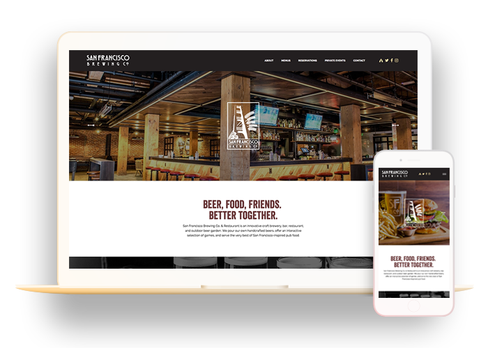
Responsive web design (RWD) is a setup where the HTML remains the same for all devices but the CSS is altered to change how the website appears on different-sized screens. In laymen's terms, responsive websites scale to fit the user's screen, whether they are using a desktop computer, laptop, tablet, or mobile phone. This means items such as your navigation menu, images, text, and forms will adjust according to the device. When done right, these elements will provide your visitor with a user-friendly experience while a non-responsive website will only create confusion and frustration for mobile users.
At Morad Media, we've been ahead of the responsive design curve for years. For over a decade, we have exclusively designed responsive websites for our clients. And now, more than ever, mobile-responsiveness is essential for any business with an active website.
From our experience with responsive web design, we have found that websites today fall into the following 3 categories. Which one does YOURS fall under?

1. The NON
If your website is non-responsive, it is likely 5+ years old with no thought or technology in place to make your site scale for mobile devices. Your website has a fixed width and has been designed to only look good on a desktop computer. Non-responsive websites are challenging to navigate by mobile, relying on the user to pinch to zoom to view different portions of the site. Many users will exit quickly if they aren't able to find information easily on your website.

2. The BAD
A bad-responsive website is likely 1-5 years old with only partial elements scaling correctly. With these websites, you will find that the more content you put in, the worse it gets. This is just as, if not more frustrating, for users than a non-responsive site.

3. The GREAT
For a great-responsive website, all elements on your website scale correctly, no matter if it's an iPhone, Android, tablet, or something in between. Not only is the site mechanically sound, but design time has been spent on two key things:
a) The user experience is such that when visitors come to your site they are easily able to execute your call-to-actions, fill out forms, log in to portals, and easily navigate through your content.
b) The organization's communication. Your web design and the user-experience both coincide to shed light on what makes your company unique. The website effectively communicates your vision and mission to your desired audience.
With over 57% of all website traffic coming from mobile and tablet, you can't afford NOT to have a responsive design in this day and age. Businesses need to leverage technology that makes it easy for them to update, manage, and grow their website. Otherwise, you risk losing mobile traffic and over half of your online sales as a result.
If your website falls into the first or second category, book a free mobile-responsiveness assessment with us today. We can help bring your website up to speed.

